
Which Color Model Is Used in Printed Designs? RGB or CMYK
Every product we see around us is full of colors. Like tea, blue, and anything else. Because without colors, we couldn’t distinguish the physical appearance of the objects.
Same case for the packaging as well. Like custom packaging boxes, they have various colors, and we identify them on the basis of colors, shape, and material. So when you’re designing something to be printed, like packaging or business cards, choosing the right color model is a must job to be completed. In this article, let’s learn a little more about the insights.
What is a Color Model? Needs to Be Understood
A color model allows us to create and apply colors in digital and print media very easily. The examples are RGB, CMYK, and Pantone. But Pantone is another option also available.
Three Main Color Models (RGB, CMYK, and Pantone) Choose on the Basis of Your Requirements
- RGB
- CMYK
- Pantone
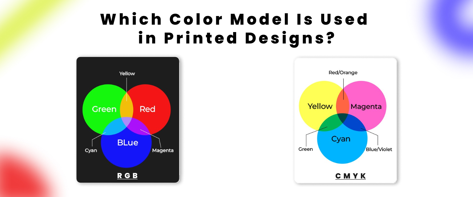
- RGB (Red, Green, Blue) option is what your computer screen, smartphone, and TV use. Digital designs, websites, and anything viewed on a screen come with an RGB color. So, what to use as a file format for this are JPEG, PNG, GIF, and SVG. So next time, choose it wisely.
- CMYK (Cyan, Magenta, Yellow, Black) option is the standard for printing. It’s an ink-based model, used by printers to layer ink on paper. The most common file formats for this are PDF, AI, EPS, and TIFF.
- Pantone option is a color system used in printing. You can use it for branding, logos, and packaging. But don’t forget to use the file formats such as .EPS, .AI, and .PDF.
But out of these, the option of CMYK is the most accurate one.
Why Is CMYK Used in Printing Designs? Not RGB or Pantone
As an example, let’s have a look at when you look at a computer screen, it emits light. That’s why screens use RGB. However, ink is now used instead of light when printing anything. And that changes everything. So CMYK is a good option, and in some cases, Pantone as well. In printing, colors are created by subtracting light.
Let’s break that down a bit more:
- Cyan absorbs red.
- Magenta absorbs green.
- Yellow absorbs blue.
- Black (K) is added for depth, detail, and true darkness.
Printers mix different percentages of these four inks to recreate the full range of colors you see in your digital design.
The Problem with Using RGB for Print
A lot of beginners create beautiful designs on their screens using RGB colors. But when they send those files to the printer, the result can be disappointing. Here’s what often happens:
- Bright neon colors appear faded.
- Deep blues or purples turn into unexpected shades.
- Black areas don’t look sharp or solid.
The reason for this is that printers are unable to comprehend RGB. The printer attempts to convert RGB files to CMYK when you send them for printing, frequently with inconsistent outcomes. Ink simply cannot replicate certain vivid colors.
Easy Steps to Follow for Proper CMYK Use in Your Design Process
Here are some easy steps to follow for color used in printing designs:
Start Your File in CMYK Mode
Adobe Illustrator, InDesign, or Photoshop are the tools that will let you choose a color mode easily. Choose CMYK from the start. This gives you a more accurate preview of how your colors will look in print.
RGB to CMYK Conversion Before Exporting
Before exporting the RGB file, you can convert it to CMYK. But some colors can be changed; it’s a good idea to check and adjust them after conversion.
Use CMYK Color Swatches
Stick to CMYK swatches or Pantone swatches made for print. Pantone colors are premixed inks used in offset printing and are known for being incredibly accurate, especially for logos and brand colors.
Get a Test Print (Proof)
Before printing in bulk, ask your printer for a proof. This is a sample print of your design.
How to Get Accurate Colors in Printing Design?
If you want your printed designs to look just like they do on screen, color accuracy is key. Here’s how to make that happen:
- Calibrate Your Devices Accurately Without Further Ado: Make sure your monitor and printer are showing colors correctly.
- Must Use ICC Profiles: These are special files that tell your devices how to display colors. Your colors will be more consistent from screen to print if you use the correct ICC profile.
- You Should Try Soft Proofing to Highlight Issues: This lets you preview how your design will look when printed, right on your screen. It’s a handy way to spot any color issues before hitting print.
- Print a Test Copy That Is Beneficial: Always do a proof print before the final run. It shows exactly how your colors will turn out, giving you a chance to tweak anything if needed.
How Packlim Makes Sure Your Packaging Is Printed in Accurate Color?
At Packlim, we don’t leave color accuracy to chance. We offer all types of color models for the boxes, cartons, and packaging. We offer digital proofs and physical samples upon request, so you know exactly what your final packaging will look like.
Why it works?This builds customer trust and showcases your company’s professional printing standards.
FAQS
What is the best color model for printing designs?
CMYK is the best and most commonly used color model for printing because it uses ink to produce accurate, consistent results on physical materials.
Can I print my design if it’s in RGB mode?
Yes, but it may not look the same. RGB designs often lose brightness and accuracy when printed. It’s best to convert your file to CMYK before printing.
What makes Pantone colors special in printing?
Pantone colors are pre-mixed, standardized shades that ensure color consistency, especially useful for branding and logos where exact color matching is critical.
How do I convert RGB to CMYK?
Design software like Adobe Illustrator or Photoshop lets you switch the color mode. Just go to the color settings and change from RGB to CMYK before exporting your design.
Why do colors look different on screen than in print?
Screens emit light (RGB), while print uses ink (CMYK). This difference in how color is created causes visual shifts between digital and printed designs.